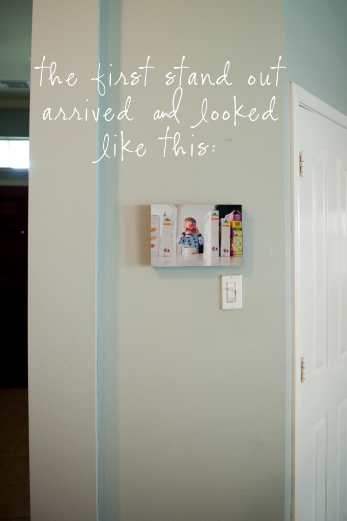
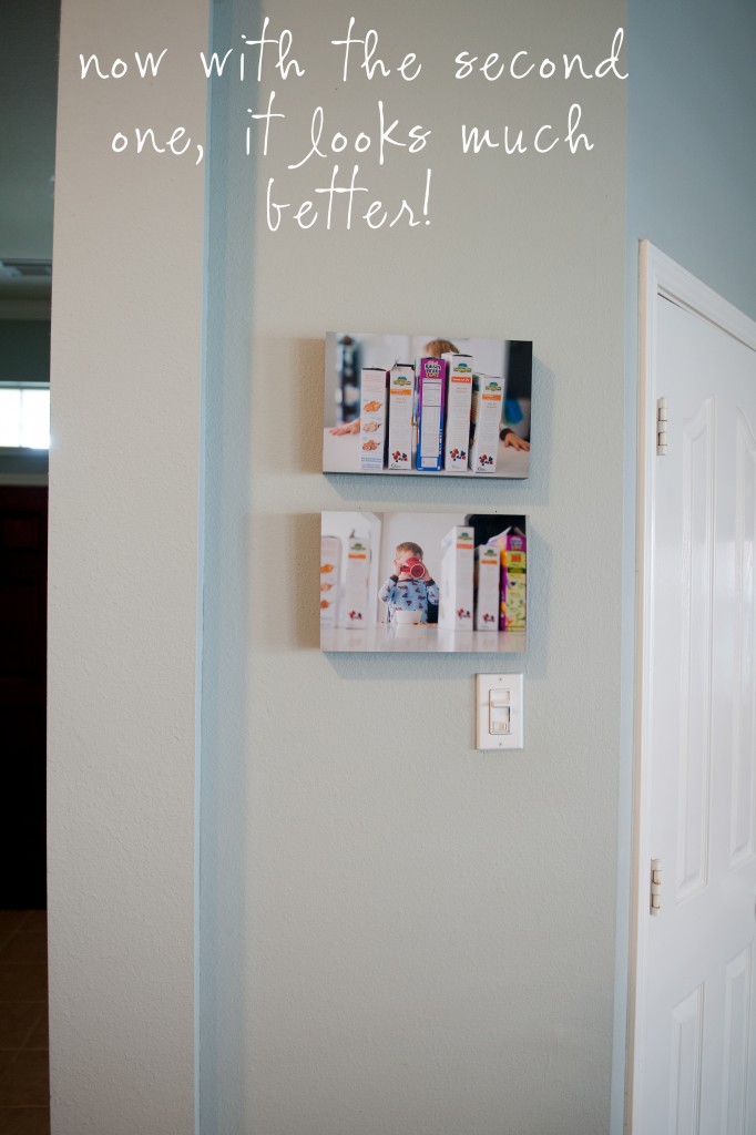
A long time ago I ordered a standout for a small wall in my kitchen. I was so excited because I loved the fun, little image of my son & couldn’t wait to get it up on that wall! When I received the stand out I realized “Oh…8X12 really isn’t THAT big.” Uh-oh. It looked out of place even on that tiny, tiny wall. I had to go back to my files of pictures I took that day to find a picture that worked to pair it up with, edit it, re-order it, wait for it to come, hang another stand-out…would’ve been so much easier if I got it right the first time.
I realized – most people don’t understand what is big & what is small in real life, what works for certain walls & what doesn’t. Back then to me 8X12 seemed big. We know what the numbers mean but it is hard to picture how big or small they are & what it will truly look like on your walls until we have already made the order. Unless you handle prints everyday like us photographers, it is hard to visualize this…we probably all know that bigger is better when decorating your walls but there are so many misconceptions on WHAT IS BIG ANYWAY????

I decided to do a post to inform. It has been on my long list of to-dos ever since then & I am finally here writing it!
Obviously this post assumes you have wall space to hang your photos on. If you don’t, you can still do a collage of small prints, stand outs or canvases – don’t just do one though because the space is small. Make that visual have impact even if it is a small space you are limited to.
If you are going to go through all the trouble of investing in a session, planning what to wear, prepping the family, etc. you may as well come away with something you can look at every day & be truly happy with.
There are two kinds of prints: desk prints (meant to go on a desk & are sized 8X10 & smaller) & wall prints (meant for the walls & are sized 11X14 & up). Really “desk prints” aren’t meant for walls. They are just too small. Unless you are going to do a collage with tons of pictures (or are dealing with the smallest wall ever created), you probably won’t be happy with an 8X10 on your wall. Even one single 11X14 isn’t very big. Here’s an example. Excuse the poorly lit hallway (with no windows & a burned out light bulb)!
(I hope you guys aren’t sick of seeing this picture! It’s not like it’s my favorite picture I have ever taken – it is just what I chose to order my samples with & I felt that for consistency & to properly convey I needed to stick with the same image!) Obviously the right looks better & fills the space more. Looking back, I should’ve gone even a size bigger. But I do have another baby on the way so maybe I will buy another 16X24 to stick next to it to fill the shelf more.
So, here are a few examples of big, too small & a good mix (all displayed on canvas). This is all just to get you thinking & help you order sizes &/or groupings that you will walk by everyday in love thinking “I am so glad I invested in this!”
This is not my home. These visuals were created with Wall Display Guides in Photoshop – love that program. This is not an unusually large fireplace either. It represents a typical size in the average home. I have the ability to add pictures to bedrooms, dining rooms, nurserys etc with this program.

Guess what size this is? If you guessed 8X10, you guessed right. WAY.TOO.SMALL.

What do you think this is? It’s an 11X14. Most people think 11X14s are HUGE. Doesn’t look too big does it?

This is a 16X24. I have heard clients say that 16X24s aren’t necessary (way too huge), but even this looks like it could even be a bit bigger to me in this space.
Here’s a 20X30 – looking better!
And lastly, 30X40. I think the 30X40 works so much better in this space.

If you are more of a collage type person then here’s an example of what you could do (all in the same fireplace space to add consistency). Here are just some ideas. These could be done with framed prints, stand outs, canvases or even mounted prints on styrene.

Okay so hopefully you get it! The moral of the story is:
-read this so that you don’t learn the hard way like I did!
-bigger IS better
-fill those walls
-there are TONS of options
-I am more than happy to help 🙂
I was inspired by a post I saw here: please check out Amy Ro for more examples on why bigger is better here: Bigger Is Better


lorena - A photog friend told me to buy canvases bigger than I think I should. I’d forgotten that until I read this. Great visuals….thanks! I’m moving and looking to order some for the new house. So, yep….you just saved me from doing the 11×14 for the fireplace mistake.
Krista Campbell Photography - Bigger IS better! Awesome post!
Jes Gwozdz - Great visuals to reinforce bigger is better. Or as I like to always say in my studio lighting class (in reference to light modifiers) – Go big or go home! LOL 😉